Visual Design
I began designing for digital experiences professionally in 2020. After designing my own website using a CMS, I quickly moved into designing for other companies.
I have helped to design co-branded landing pages, app pages, emails and product mocks.
Landing Page + Email
Cobranded Companions
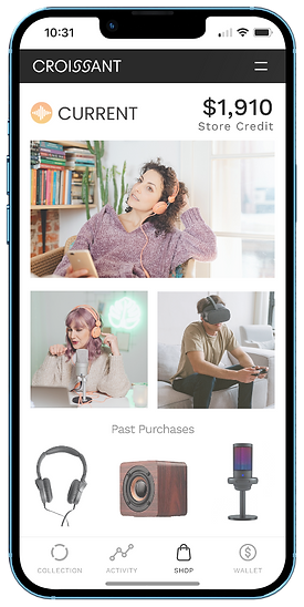
Croissant is a product that officially launched in 2023. It integrates with merchants' systems at the point of sale to catalogue purchases for customers - allowing them to resell items on the Croissant app with the click of a button.
I worked under the direction of a lead designer and brand management team to collaboratively design this cobranded landing page and companion email. These pages are tailored to each merchant incorporating their company branding, while educating consumers about the Croissant product. Landing pages are sent to merchant teams as a sample of what to include once the product has been integrated and is live on the site.


Email Design
Once the Croissant product has been added to a merchant site, customers will receive ongoing communications. The idea is to send refreshed and updated email communications to merchants to continue to promote and educate their customers on the product.
Working closely with the branding team, I collaborated on multiple iterations of each email - refining elements such as items, colors, and text layout. Notably, we updated the CTA at the end of the email to feature the distinct "Croissant Blue" color, emphasizing that it is a clickable link. To align with the unique branding guidelines of each client, we ensured that the header, wording, and overall typeface were tailored accordingly, maintaining consistency with individual brand identities.


App Pages + Branding Mocks
I created personalized app mock-ups to streamline Croissant's sales process, showcasing how merchant products could integrate into the platform. These mocks helped potential clients visualize the product's versatility without needing custom designs until they moved further down the sales pipeline.
I developed two conceptual brands: an electronics merchant featuring a vibrant, youthful aesthetic with a logo inspired by frequency waves, and a luxury clothing brand with a sleek, editorial-inspired identity. For the fashion brand, I curated imagery with a blend of formality and playfulness, adjusting tones in Photoshop to create a cohesive campaign look. Each mock demonstrated how the product could seamlessly align with diverse merchant types, capturing attention and driving interest.

